Category : research

Clever Paddy Power marketing!

I was wondering how long football fans would go without the banter of Manchester United’s retirement of Sir Alex Ferguson. You could argue that with him gone the team might not be able to keep up their standards. I’m not a massive fan of football myself but I keep an eye on the news now and again to see what’s what so when the news of Ferguson’s retirement was in full swing it got a lot of people asking the same question, “how well will they play now?”. Well as of January 2014 they’ve only won one match and on the 19th of January, they lost to Everton 3-1 which to say the least is incredibly disappointing.

So how did people react within the advertising and marketing world? Paddy Power unveiled this;

wax-twitter1
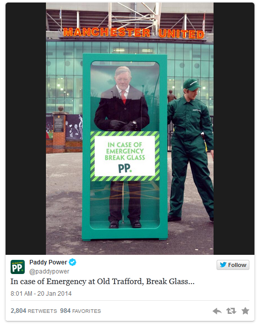
Ooooo that’s just down right cheeky but it has grabbed them a lot of attention! And rightly so, the box contains an accurate wax figure to mimic the legend, whilst the box itself clearly showing their brand’s colours and logo. So why the wax figure? There are rumours being passed around on his return after the current coach has failed to seal victories for the team. Who is responsible I hear you ask? According to this source, Lexis are the masterminds behind this stunt. Just goes to show that thinking outside the box generally is the best way to create a lot of hype.

Continue Reading

Subaru – shocking or not?

I follow a lot of good sources for advertising and marketing on facebook and over the weekend one of AdWeek’s posts really stuck in my head. The item in question is Subaru’s “They Lived” TV ad. Initially there wasn’t much shock evoked at the sight of the complete wreck that was left over and what killed it for me was the very apparent American dramatization.

Here is the video via YouTube:

After actually watching it several times and analyzing the amount of damage sustained during the crash, if indeed it was real or  simulated? and after giving it a second shot, it does make a bit of an impact, however for it to be more effective the soundtrack would need to be a little more sombre with some violins and the “they lived” to sound a bit more sincere rather than surprised. In fact, that last comment is what kills the Ad for me, it just doesn’t make it believable, if I was stood in front of a totaled car my rational thought would be one of disbelief combined with sorrow. (I have actually done before and believe me, when you question the mortality of the occupants, it isn’t a tone of surprise you use).


(Source)

CREDITS
Client: Subaru of America
Spot: “They Lived”

Agency: Carmichael Lynch
Chief Creative Officer: Dave Damman
Executive Creative Director: Randy Hughes
Writer, Associate Creative Director: Conn Newton
Art Director, Associate Creative Director: Michael Rogers
Head of Production: Joe Grundhoefer
Executive Producer: Brynn Hausmann
Business Manager: Vicki Oachs
Account Service Team: David Eiben, Krista Kelly, Kate Moret

Production Company: Park Pictures
Director: Lance Acord
Executive Producer: MaryAnn Marino
Line Producer: Aristides McGarry
Director of Photography: Lance Acord

Editing House: Whitehouse Post
Editor: Stephen Jess
Assistant Editor: Tim Quackenbush
Visual Effects: Steve Medin, Volt
Telecine: Sean Coleman, Company 3
Audio Mix, Sound Design: Carl White, BWN Music

“Clear Moment”
Composer: Miles Hankins, scoreAscore
Music Supervisor: Jonathan Hecht

On-camera talent: Tim Lane, Diane Luby Lane, Millie Lane, Charlie Burrows, Aaron Norwell, Frederick Lawrence, Stephen Taylor, Kevin Bowers
Voiceover Talent: Tim Lane, Justin Beere (announcer)

Continue Reading

FOX pranks Norman Reedus

I’m not going to lie to you, I’m a massive The Walking Dead fan. Zombies have always been a massive fascination of mine since I first saw Night of the Living Dead the 1968 black & white film by George A. Romero. At present the 4th series of the show is on a mid season break cuing the outbreak of Ads and social media posts, but we expect this so FOX decided to add a little spice to the already bubbling cooking pot that is fans collectively gossiping and speculating what will happen next by releasing a promo. Like stated we already expect this but they also decided to prank one of their cast members, the incredible crossbow wielding bad ass that is Norman Reedus AKA Daryl Dixon.

It’s quite genius really, they use a social star named Nick Santonastasso who is best known for his zombie pranks on the public via Vines as part of the “#getFOXed” campaign. This is where fans of their shows get the all star extraordinary fan experiences by meeting the cast and getting involved in so as Nick is a massive fan and his pranks combined it makes a perfect opportunity to help promote the shows revival come February 9th. They send him all the way to Tokyo, get the incredible Greg Nicotero to apply his award winning special effects on to him and then set the stage for the prank to begin.

I’ll let the video give you the rest of the explanation, enjoy!

Currently the fan base of the comic book (sorry! “Graphic Novel”) gone TV show is incredibly strong, the series is shown in over 120 countries and often averages 10.40 million viewers as of season 3.

Never ignore the power of a great prank to get people talking, it makes for incredible marketing. I like

(source)

Continue Reading

5 creative typographic images

1. Derek Ma – “Hair Types”

‘Hair Types” is a typography illustration of lettertype created out of hair and facial hair. It was shown in May 30-June 2 2013 at the Toronto Creative Type Exhibition 5 at Cooper Cole Gallery. I really enjoy the playful nature of this one, while the letters may not be as noticable at first a double take can give you the full picture. This is a great reminder that typography doesn’t need to be rigid and can be quite fluid in form.

2. Thomas Yang – “Feed your imagination”

Typography in the calligraphic style, the type gives a nice humorous description of what the colour of smarties can represent in everyday life. I can’t say for certain what font it is or maybe the type is hand rendered?

3. Aushiel Design – Typography Creative

A nice little selection of words that draw heavy enphasis on their meaning, yellow for lemon, lemon section for the “o” etc.

4. Alison Carmichael – “There are some places…

Great image based typography to illustrate a point with brilliant colour choice.

5. Bob Cruz – Adobo Magazine

I couldn’t find much information on this. It appears to be a campaign showing insight into the world of advertising via graphic design. You can clearly see care has been taken to mold each letter into the shape of what they are being used to represent. The curl on the lid for the Haagen Dazs is brilliantly formed to create the illusion.

Continue Reading

Clouds

When creating my little clouds, I struggled to make them just right. The always seemed to be a bit too cartoon like and didn’t fall into the correct style.

After doing some googling I found these vectors here: http://designyoutrust.com/web/the-cloud-vector-pack/

DYT-the-cloud-icon-vector-pack

But I didn’t want to just use a template when practicing with the pen tool is more fun. I copied the general shape from the picture and got the desired effect after changing the stroke options within illustrator.

Continue Reading

The Tipi Tents!

I wanted to capture more of what Glastonbury represents, but instead of using music notes and all that rubbish, the initial thought was people, but illustrating that would be a bit odd. Other than mud and wellies, Glastonbury has a lot of tents so to keep in with the hippie movement and roots I noticed that the official site had tipi tents within the background.

glastonbury-site-bgPlacing this image into illustrator combined with the pen tool, I could easily build up nice simple shapes to create my own version of a tipi tent.

tipi-02-02

Continue Reading

Monsterism?

A brief chat with my tutor lead me to a style called monsterism, it’s very basic graphically but visually, rather nice! I’m quite a fan of nice simple style and looking at Pete Fowler’s work has introduced me to such a style. Take a look for yourself here : http://monsterism.net/

The clouds are a style I wish to use for my designs and the mono tone colours too.

Continue Reading