5 creative typographic images
1. Derek Ma – “Hair Types”
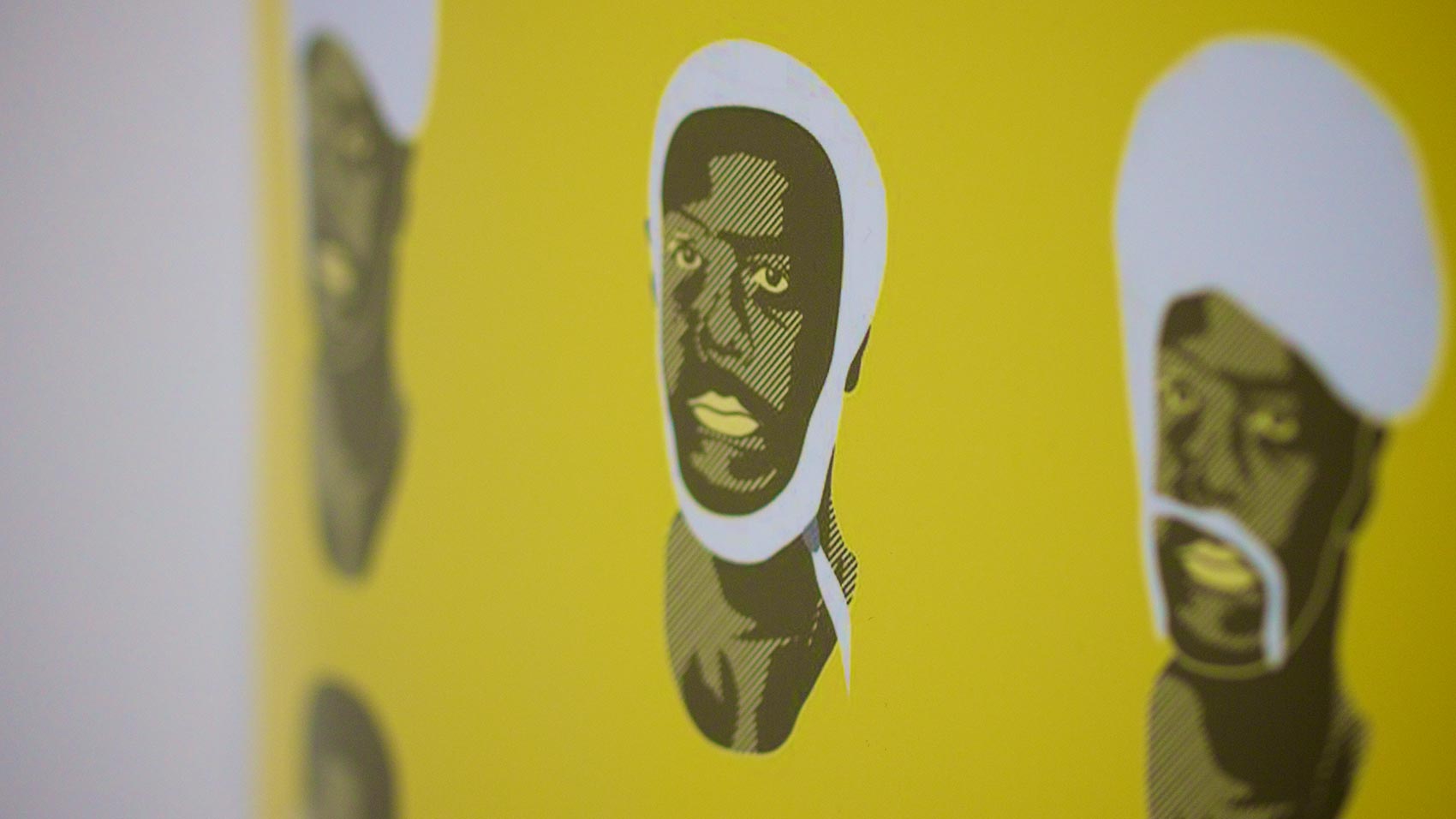
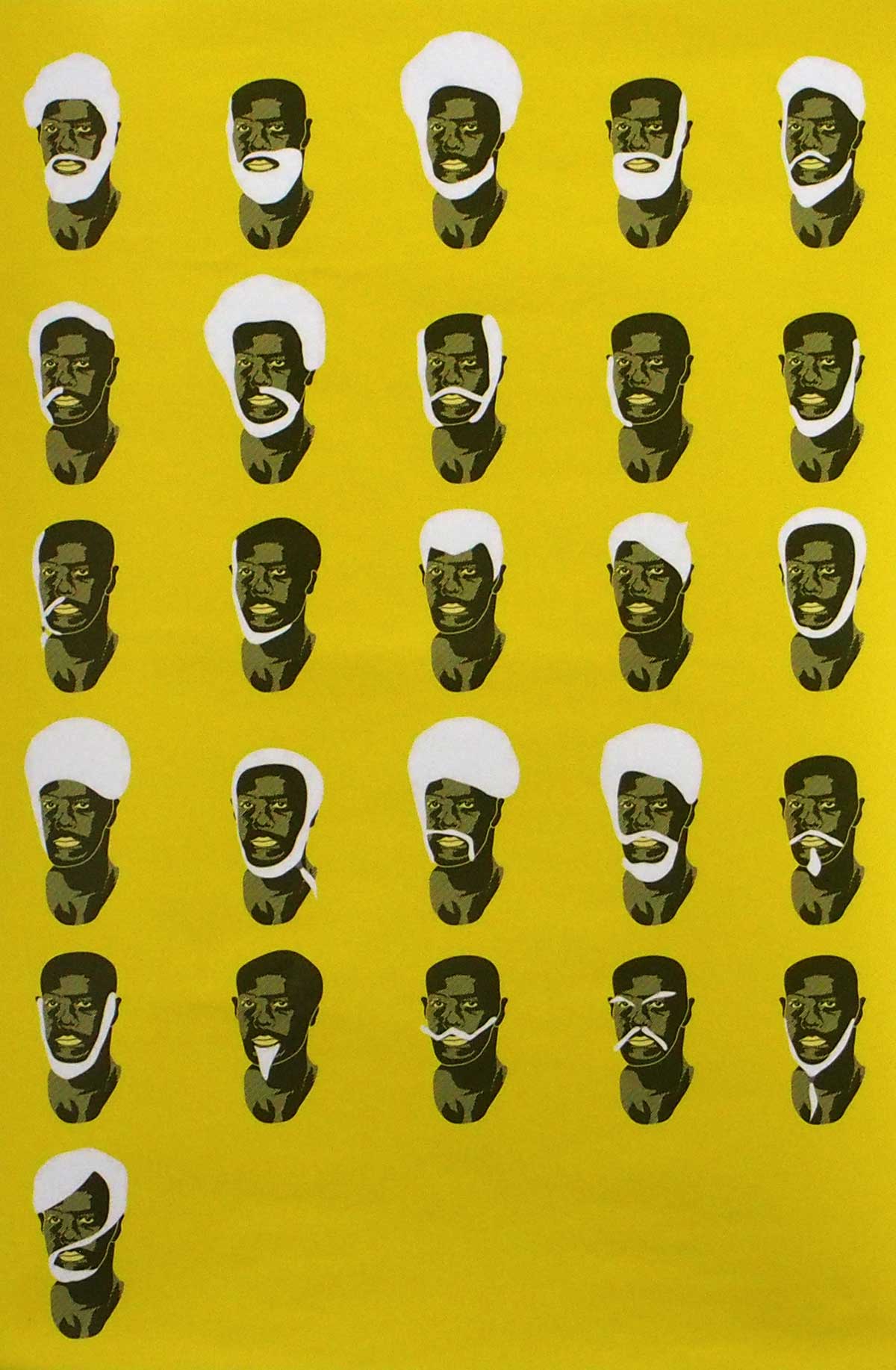
‘Hair Types” is a typography illustration of lettertype created out of hair and facial hair. It was shown in May 30-June 2 2013 at the Toronto Creative Type Exhibition 5 at Cooper Cole Gallery. I really enjoy the playful nature of this one, while the letters may not be as noticable at first a double take can give you the full picture. This is a great reminder that typography doesn’t need to be rigid and can be quite fluid in form.
2. Thomas Yang – “Feed your imagination”
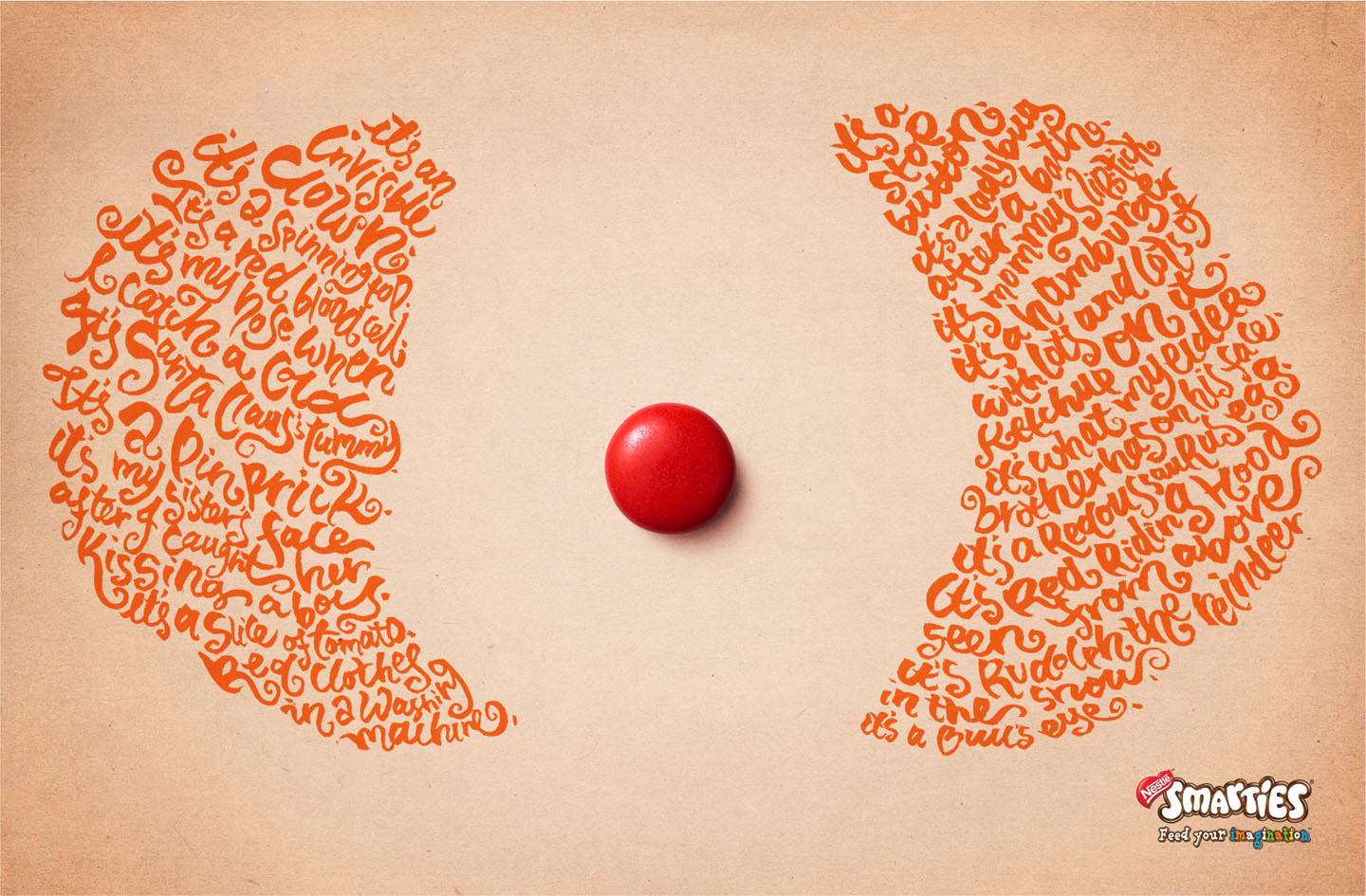
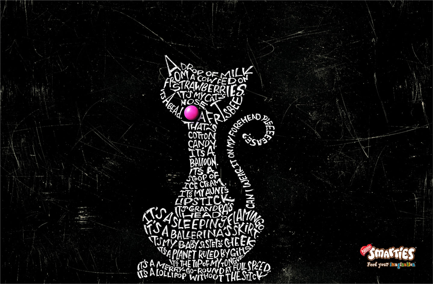
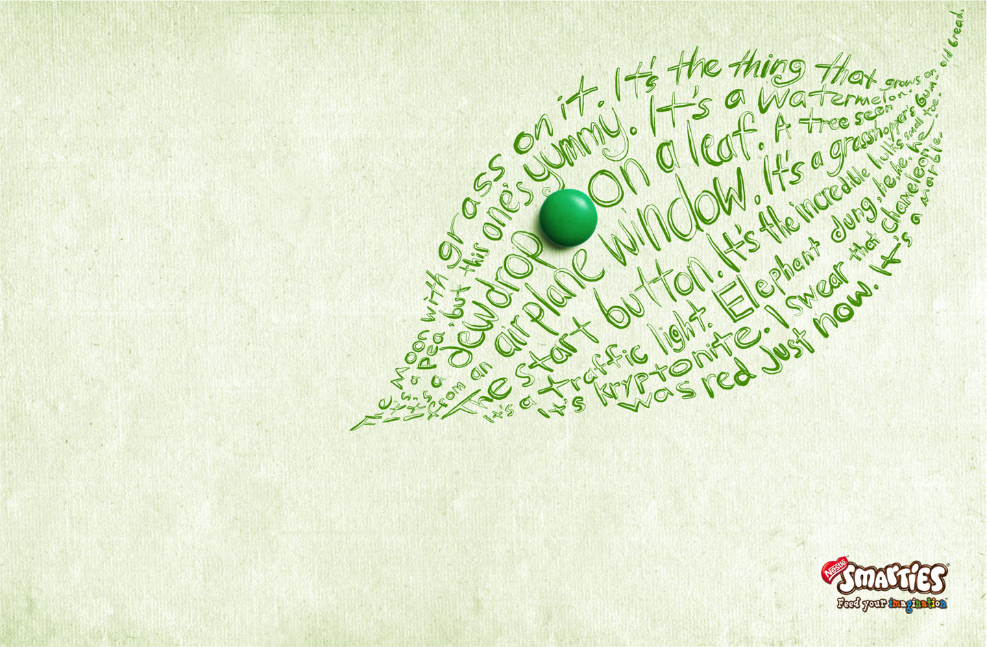
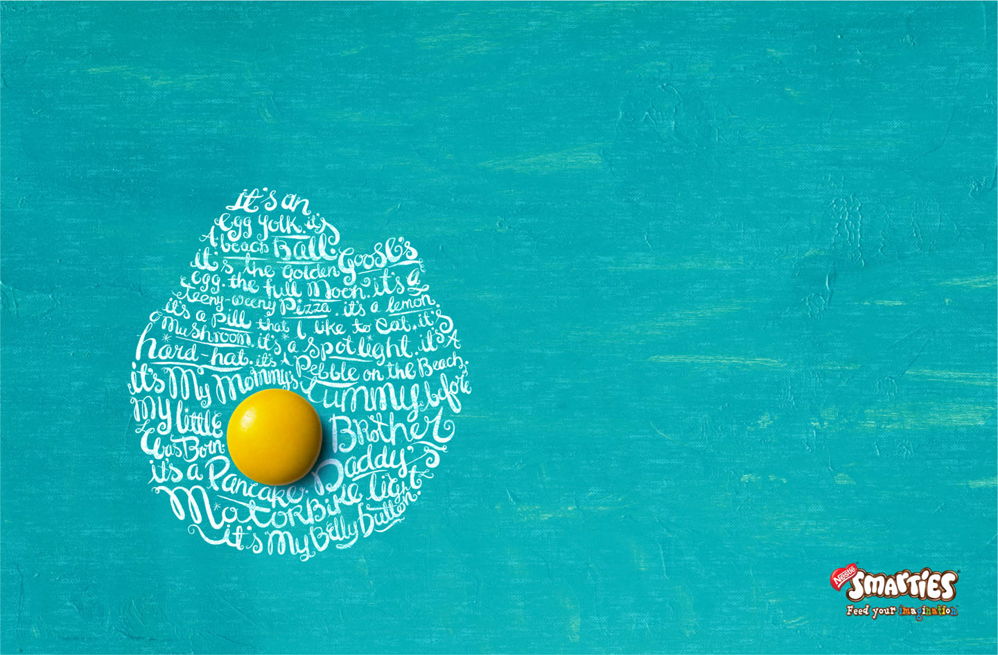
Typography in the calligraphic style, the type gives a nice humorous description of what the colour of smarties can represent in everyday life. I can’t say for certain what font it is or maybe the type is hand rendered?
3. Aushiel Design – Typography Creative
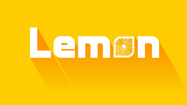
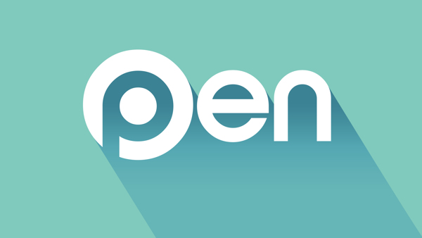
A nice little selection of words that draw heavy enphasis on their meaning, yellow for lemon, lemon section for the “o” etc.
4. Alison Carmichael – “There are some places…“
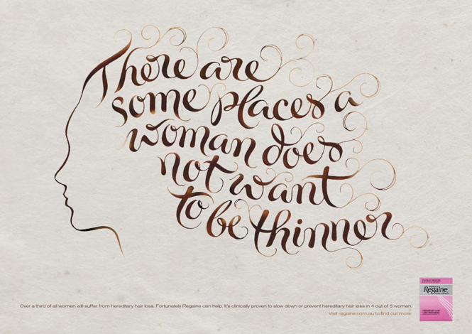
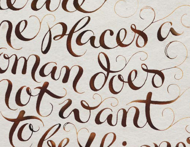
Great image based typography to illustrate a point with brilliant colour choice.
5. Bob Cruz – Adobo Magazine
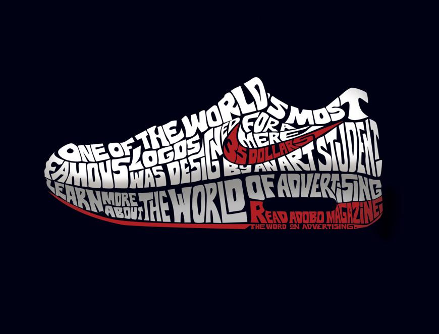
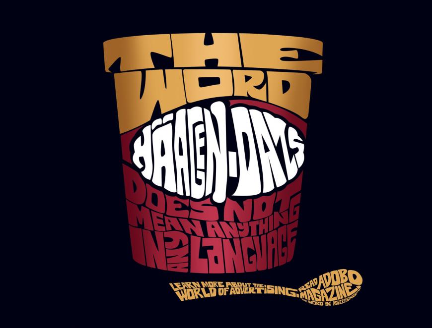
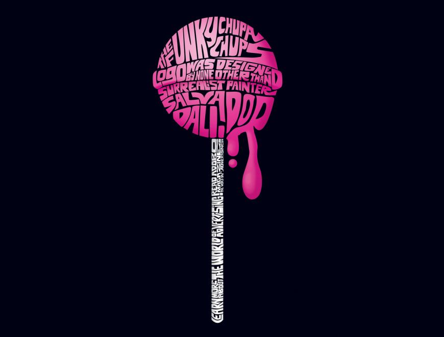
I couldn’t find much information on this. It appears to be a campaign showing insight into the world of advertising via graphic design. You can clearly see care has been taken to mold each letter into the shape of what they are being used to represent. The curl on the lid for the Haagen Dazs is brilliantly formed to create the illusion.