Blog

Clouds

When creating my little clouds, I struggled to make them just right. The always seemed to be a bit too cartoon like and didn’t fall into the correct style.

After doing some googling I found these vectors here: http://designyoutrust.com/web/the-cloud-vector-pack/

DYT-the-cloud-icon-vector-pack

But I didn’t want to just use a template when practicing with the pen tool is more fun. I copied the general shape from the picture and got the desired effect after changing the stroke options within illustrator.

Continue Reading

The Tipi Tents!

I wanted to capture more of what Glastonbury represents, but instead of using music notes and all that rubbish, the initial thought was people, but illustrating that would be a bit odd. Other than mud and wellies, Glastonbury has a lot of tents so to keep in with the hippie movement and roots I noticed that the official site had tipi tents within the background.

glastonbury-site-bgPlacing this image into illustrator combined with the pen tool, I could easily build up nice simple shapes to create my own version of a tipi tent.

tipi-02-02

Continue Reading

Monsterism?

A brief chat with my tutor lead me to a style called monsterism, it’s very basic graphically but visually, rather nice! I’m quite a fan of nice simple style and looking at Pete Fowler’s work has introduced me to such a style. Take a look for yourself here : http://monsterism.net/

The clouds are a style I wish to use for my designs and the mono tone colours too.

Continue Reading

The history of visual language explained

After speaking with my lecturer about Semiotics and its vast media, written language came up through the discussion on cave paintings leading onto Hieroglyphics. After wondering about the transition from symbols, glyphs and what we write today, I stumbled across this site with a nice history on how it came together.

Link here

Continue Reading

Dance music and their logos

I know a designer on facebook who produces work for the Dance community, his work inspired me to rework my initial logo to better suit the pyramid theme originally thought out.
His name is Andrew Marc, some of his work can be found here. Below is some of his work from his facebook profile.

Continue Reading

The worst advert ever?

I’m an avid motorcyclist, if I hear a bike going down the road from 10 miles away I will seriously spend the next 5 minutes looking for it just so I can make sure I’ve accurately guessed which bike it is based purely on the engine’s note (I’ve even been accused of being able to tell what colour it is by engine sound alone haha). One of my all time favorite bikes is the Ducati Monster, which reviewed by many is said to be a very lacking and dull motorcycle, well imagine my disappointment when I saw the advert for the new model available.

WHY?!? How can the guys over at Ducati America let this advert out to the public? Did they seriously sit back and think “YES THIS IS A MASTER PIECE!”. Who is it even aimed at? Who picked the voice actor and backing track at all to match the visuals which are 40% bollocks and 60% boring riding? It just doesn’t make any sense at all?! How ever I’m not the only one who has commented on the video, there seems to be a loud echo of how bad this ad is and it has now attracted a lot of negativity to the bike itself.

This is an advert made by someone who does not ride a motorcycle and if they do, they’re doing it wrong, oh so wrong.

Below is how to do it correctly, I’ll let you compare the two and ask, which one gives you more of a thrill?
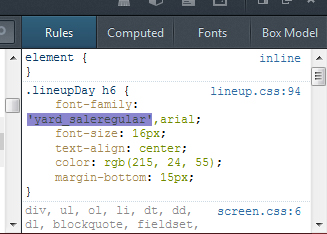
Continue Reading